Code
#### Blank Map of PA Municipalities ####

# creating this visualization requires some packages and a df that are loaded/created later

ggplot(census_data) + geom_sf() + theme_void()
A clustering analysis at the ACS county subdivision level
As a resident of Pennsylvania my entire life, I’ve often wondered what defines one region of the state from another. Particularly as a Central Pennsylvanian, there are some blurred lines as to where the Philadelphia side stops and the Pittsburgh side begins. For example, you can start in the urban sprawl of Philadelphia, drive across acres of green farmland, over rolling hills, then much bigger hills, and before you know it, find yourself somewhere that looks like West Virginia and tastes like potatoes. But why agonize over regional boundaries when I can have R do it for me?
This post is heavily inspired by Conor Tompkins’ What region is Pittsburgh in? where he uses essentially the same clustering procedure to cut-up the entire eastern portion of the continental United States. If you want to see what that looks like, I strongly encourage you to check out his post (in turn inspired by Kyle Walker).
My analysis zooms-in on just the state of PA and goes beyond the county level down to Minor Civil Divisions (MCDs), which, in the case of Pennsylvania, are individual municipalities. If what you see here gets you excited, please take it and explore your own home state!
Note: This clustering is purely based on demographic, not geographic, characteristics (though we will find that clusters can often still be ascribed to distinctive land features).
For reference, here is a map of the MCDs of Pennsylvania (henceforth referred to interchangeably with municipalities).
#### Blank Map of PA Municipalities ####
# creating this visualization requires some packages and a df that are loaded/created later
ggplot(census_data) + geom_sf() + theme_void()
Load packages and prep the environment.
#### Load Packages ####
library(tidyverse)
library(sf)
library(tidycensus)
library(rgeoda)
library(rmapshaper)
library(leaflet)
library(leaflet.extras)
library(janitor)
library(hrbrthemes)
library(patchwork)
library(mapview)
library(leafpop)
library(broom)
library(scales)
library(GGally)

options(tigris_use_cache = TRUE,
        scipen = 999,
        digits = 4)
set.seed(1)
I prepared the variables for analysis and gathered the census data. To acquire total counts for certain age ranges, I recoded many of the variables to the same name, then grouped and added their estimated totals. The variables I chose have to do with education, age, poverty, home ownership, and race (white only). Also note that while I include a below hs education variable, I removed it for the later principal component analysis.
#### Prep ACS data and variables ####

#census_api_key("insert key here", install = TRUE)

acs_vars <- load_variables(2023, "acs5", cache = TRUE)

vars_acs <- c(notenrolled_male_5 = "B14003_023",
              notenrolled_male_10 = "B14003_024",
              notenrolled_male_15 = "B14003_025",
              notenrolled_female_5 = "B14003_051",
              notenrolled_female_10 = "B14003_052",
              notenrolled_female_15 = "B14003_053",
              none_25 = "B15003_002",
              nurs_25 = "B15003_003",
              k_25 = "B15003_004",
              first_25 = "B15003_005",
              second_25 = "B15003_006",
              third_25 = "B15003_007",
              fourth_25 = "B15003_008",
              fifth_25 = "B15003_009",
              sixth_25 = "B15003_010",
              seventh_25 = "B15003_011",
              eighth_25 = "B15003_012",
              ninth_25 = "B15003_013",
              tenth_25 = "B15003_014",
              eleventh_25 = "B15003_015",
              twelfth_25 = "B15003_016",
              bach_25 = "B15003_022",
              mast_25 = "B15003_023",
              prof_25 = "B15003_024",
              phd_25  = "B15003_025",
              median_age = "B01002_001",
              male_65 = "B01001_020",
              male_67 = "B01001_021",
              male_70 = "B01001_022",
              male_75 = "B01001_023",
              male_80 = "B01001_024",
              male_85 = "B01001_025",
              female_65 = "B01001_044",
              female_67 = "B01001_045",
              female_70 = "B01001_046",
              female_75 = "B01001_047",
              female_80 = "B01001_048",
              female_85 = "B01001_049",
              dem_white = "B03002_003",
              total_population = "B01003_001",
              poverty = "B17001_002",
              unemployment = "B23025_005",
              homeowner = "B25003_002"
              )

census_data_acs <- get_acs(year = 2023,
                           state = "PA",
                           variables = vars_acs,
                           geography = "county subdivision",
                           geometry = TRUE) |>
  mutate(variable = recode(variable,
                           notenrolled_male_5 = "not_enrolled",
                           notenrolled_male_10 = "not_enrolled",
                           notenrolled_male_15 = "not_enrolled",
                           notenrolled_female_5 = "not_enrolled",
                           notenrolled_female_10 = "not_enrolled",
                           notenrolled_female_15 = "not_enrolled",
                           none_25 = "belowhs",
                           nurs_25 = "belowhs",
                           k_25 = "belowhs",
                           first_25 = "belowhs",
                           second_25 = "belowhs",
                           third_25 = "belowhs",
                           fourth_25 = "belowhs",
                           fifth_25 = "belowhs",
                           sixth_25 = "belowhs",
                           seventh_25 = "belowhs",
                           eighth_25 = "belowhs",
                           ninth_25 = "belowhs",
                           tenth_25 = "belowhs",
                           eleventh_25 = "belowhs",
                           twelfth_25 = "belowhs",
                           bach_25 = "college",
                           mast_25 = "college",
                           prof_25 = "college",
                           phd_25 = "college",
                           median_age = "median_age",
                           male_65 = "population_over65",
                           male_67 = "population_over65",
                           male_70 = "population_over65",
                           male_75 = "population_over65",
                           male_80 = "population_over65",
                           male_85 = "population_over65",
                           female_65 = "population_over65",
                           female_67 = "population_over65",
                           female_70 = "population_over65",
                           female_75 = "population_over65",
                           female_80 = "population_over65",
                           female_85 = "population_over65",
                           dem_white = "dem_white",
                           total_population = "total_population",
                           poverty = "poverty",
                           unemployment = "unemployment",
                           homeowner = "homeowner"
 ),
 variable = factor(variable, levels = c("not_enrolled", "belowhs", "college", "median_age", "population_over65", "total_population", "dem_white", "poverty", "unemployment", "homeowner"))) |>
  group_by(GEOID, NAME, variable) |>
  summarize(estimate = sum(estimate), geometry = first(geometry), .groups = "drop")

census_data <- census_data_acsThis code maps the variables onto the municipalities of Pennsylvania.
#### Map of Census Data for Each Municipality ####

census_vars <- census_data |>
  select(-c(GEOID)) |>
  pivot_wider(names_from = variable, values_from = estimate) |>
  select(-c(geometry)) |>
  mutate(across(-c(NAME, geometry, total_population, median_age), ~.x / total_population, .names = "pct_{.col}")) |>
  rowwise() |>
  ungroup() |>
  select(NAME, total_population, median_age, starts_with("pct_")) |>
  rename_with(~str_remove(.x, "^pct_")) |> rename_with(~str_remove(.x, "^dem_" )) |>
  pivot_longer(-c(NAME, geometry))

map_census_data <- function(x, var){

  x |>
    filter(name == var) |>
    ggplot(aes(fill = value)) +
    geom_sf(lwd = 0) +
    facet_wrap(vars(name)) +
    scale_fill_viridis_c() +
    guides(fill = "none") +
    theme_void()

}

var_vec <- census_vars |>
  st_drop_geometry() |>
  distinct(name) |>
  pull()

map_list <- map(var_vec, ~map_census_data(census_vars, .x))

wrap_plots(map_list)
This code calculates relevant variables as percentages. It also omits rows with NA cases – a very important step otherwise the R environment will crash when trying to calculate spatial weights. Be sure also to remove rows with empty geometry (if they don’t already have an NA case).
#### County Subdiv.-Level Demographics ####

census_tracts <- census_data |>
  group_by(NAME, variable) |>
  summarize(estimate = sum(estimate)) |>
  ungroup()
census_tracts_wide <- census_tracts |>
  pivot_wider(names_from = variable, values_from = estimate) |>
  rename_with(str_to_lower, -c(NAME, geometry)) |>
  mutate(across(-c(NAME, geometry, total_population, median_age), ~.x / total_population, .names = "pct_{.col}")) |>
  rowwise() |>
  ungroup() |>
  na.omit()

glimpse(census_tracts_wide)
Rows: 2,565
Columns: 20
$ NAME <chr> "Abbott township, Potter County, Pennsylvania", …
$ geometry <POLYGON [°]> POLYGON ((-77.83 41.57, -77..., POLYGON …
$ not_enrolled <dbl> 0, 17, 423, 87, 18, 37, 0, 0, 10, 0, 0, 0, 1, 6,…
$ belowhs <dbl> 20, 75, 1906, 111, 233, 109, 3, 0, 68, 5, 67, 23…
$ college <dbl> 28, 67, 20474, 6838, 1042, 96, 16, 0, 514, 33, 9…
$ median_age <dbl> 59.5, 41.9, 41.9, 41.0, 45.1, 35.7, 27.7, 33.0, …
$ population_over65 <dbl> 95, 104, 12016, 2407, 1200, 182, 7, 0, 213, 69, …
$ total_population <dbl> 219, 804, 58470, 15056, 5707, 1066, 129, 51, 233…
$ dem_white <dbl> 217, 766, 41954, 13941, 5486, 1026, 122, 51, 204…
$ poverty <dbl> 38, 68, 4073, 917, 390, 94, 7, 0, 240, 19, 145, …
$ unemployment <dbl> 3, 16, 1623, 289, 13, 19, 0, 0, 24, 4, 23, 44, 0…
$ homeowner <dbl> 83, 227, 17473, 4985, 2080, 284, 34, 13, 625, 87…
$ pct_not_enrolled <dbl> 0.000000, 0.021144, 0.007234, 0.005778, 0.003154…
$ pct_belowhs <dbl> 0.091324, 0.093284, 0.032598, 0.007372, 0.040827…
$ pct_college <dbl> 0.127854, 0.083333, 0.350162, 0.454171, 0.182583…
$ pct_population_over65 <dbl> 0.43379, 0.12935, 0.20551, 0.15987, 0.21027, 0.1…
$ pct_dem_white <dbl> 0.9909, 0.9527, 0.7175, 0.9259, 0.9613, 0.9625, …
$ pct_poverty <dbl> 0.17352, 0.08458, 0.06966, 0.06091, 0.06834, 0.0…
$ pct_unemployment <dbl> 0.013699, 0.019900, 0.027758, 0.019195, 0.002278…
$ pct_homeowner <dbl> 0.3790, 0.2823, 0.2988, 0.3311, 0.3645, 0.2664, …Check the correlation between variables.
#### Check Correlation between Variables ####

#https://stackoverflow.com/questions/44984822/how-to-create-lower-density-plot-using-your-own-density-function-in-ggally
my_fn <- function(data, mapping, ...){

  p <- ggplot(data = data, mapping = mapping) +
    geom_bin_2d() +
    scale_fill_viridis_c() +
    scale_x_continuous(labels = label_number(scale_cut = cut_short_scale())) +
    scale_y_continuous(labels = label_number(scale_cut = cut_short_scale()))
  p
}

census_tracts_wide |>
  st_drop_geometry() |>
  select(total_population, median_age, contains("pct_")) |>
  rename_with(~str_remove(.x, "^pct_dem_")) |> rename_with(~str_remove(.x, "^pct_")) |>
  ggpairs(lower = list(continuous = my_fn)) +
  theme_bw()
Principal Component Analysis (PCA) is a powerful tool that de-correlates the data so information isn’t “double-counted”. Principal components (PCs) are used instead of just the variables to create the clusters. A rotation matrix is used to graph the variables on the first two principal components. This can tell us how “influenced” the principal components are by the different variables.
#### Creating principal Components ####

#https://clauswilke.com/blog/2020/09/07/pca-tidyverse-style/

census_pca <- census_tracts_wide |>
  select(NAME, total_population, median_age, contains("pct")) |>
  select(-pct_belowhs) |> # remove belowhs from analysis (heavy overlap with college)
  st_drop_geometry() |>
  rename_with(~str_remove(.x, "^pct_dem_")) |> rename_with(~str_remove(.x, "^pct_"))

pca_fit <- census_pca |>
  select(where(is.numeric)) |>
  prcomp(scale = TRUE)

# define arrow style for plotting
arrow_style <- arrow(
  angle = 20, ends = "first", type = "closed", length = grid::unit(8, "pt")
)

# plot rotation matrix
pca_fit |>
  tidy(matrix = "rotation") |>
  pivot_wider(names_from = "PC", names_prefix = "PC", values_from = "value") |>
  ggplot(aes(PC1, PC2)) +
  geom_segment(aes(color = column), xend = 0, yend = 0, arrow = arrow_style) +
  ggrepel::geom_label_repel(aes(label = column, fill = column)) +
  coord_fixed() + # fix aspect ratio to 1:1
  guides(fill = "none",
         color = "none") +
  theme_bw()
From the matrix plot above, we see that the first PC corresponds slightly positively with unemployment and population while corresponding very negatively to home ownership, an aging population, and increased white representation. The second PC focuses more on education and poverty with heavy influences from college, poverty and unenrollment.
The next graph shows the amount of variance each PC accounts for. Data that is strongly correlated data will have the majority of variance explained by a few PCs.
#### Variance Captured by PCs ####

pca_fit |>
  tidy(matrix = "eigenvalues") |>
  ggplot(aes(PC, percent)) +
  geom_col(fill = "#56B4E9", alpha = 0.8) +
  scale_x_continuous(breaks = 0:9) +
  scale_y_continuous(
    labels = percent_format(),
    expand = expansion(mult = c(0, 0.01))
  ) +
  labs(x = "PC",
       y = "% of variance explained") +
  theme_bw()
As a sanity check, we can verify that the newly created PCs are not correlated to each other.
#### Checking Correlation between PCs ####

census_pca_augment <- augment(pca_fit, census_pca) |>
  select(-.rownames)

census_pca_augment |>
  select(contains(".fitted")) |>
  GGally::ggpairs(lower = list(continuous = my_fn)) +
  theme_bw()
We can check to see where the PCs vary the most across Pennsylvania.
#### Mapping PCs onto PA ####

census_tracts_pca <- census_tracts_wide |>
  select(NAME, geometry) |>
  left_join(census_pca_augment, by = join_by(NAME))

census_tracts_pca_long <- census_tracts_pca |>
  select(NAME, .fittedPC1:.fittedPC4) |>
  pivot_longer(contains(".fitted"))

pc_vars <- census_tracts_pca_long |>
  distinct(name) |>
  pull()

map_pca <- function(x, var){

  x |>
    filter(name == var) |>
    ggplot() +
    geom_sf(aes(fill = value), lwd = 0) +
    facet_wrap(vars(name)) +
    scale_fill_viridis_c() +
    scale_x_continuous(labels = label_number(scale_cut = cut_short_scale())) +
    scale_y_continuous(labels = label_number(scale_cut = cut_short_scale())) +
    theme_void()

}

map_pca_list <- map(pc_vars, ~map_pca(census_tracts_pca_long, .x))

wrap_plots(map_pca_list)
Due to the complexity of MCDs and my desire to avoid isolates (MCDs without a cluster), I utilize queen weights. This allows for more neighbors and assigns clusters based on more information than rook weights would provide. Further, I smooth the edges of the MCDs prior to clustering to ensure cleaner clusters. Check out Conor Tompkins’ code if you end up needing to remove isolates.
#### Queen Contiguity Weights and Getting Clusters####

#https://geodacenter.github.io/rgeoda/articles/rgeoda_tutorial.html#spatial-clustering

census_tracts_pca <- st_transform(census_tracts_pca, crs = 6563) |>
  st_simplify(dTolerance = 50, preserveTopology = TRUE)

# SIMPLIFYING BEFORE OR AFTER WEIGHTING MAY ALTER CLUSTERS

w_queen <- queen_weights(census_tracts_pca)

summary(w_queen)
name value
1 number of observations: 2565
2 is symmetric: TRUE
3 sparsity: 0.00187833673418982
4 # min neighbors: 1
5 # max neighbors: 34
6 # mean neighbors: 4.81793372319688
7 # median neighbors: 5
8 has isolates: FALSEThe PCs are selected for clustering. I set the minimum population bound for clusters at 5% of the total PA population. While this method does not set a number of clusters to be formed, adjusting the min bound will force the number of clusters to increase or decrease. This code outputs a summary of the clusters.
cluster_df <- census_tracts_pca |>
  select(contains(".fitted")) |>
  st_drop_geometry()

bound_vals <- census_tracts_wide['total_population']

min_bound <- census_tracts_wide |>
  st_drop_geometry() |>
  summarize(total_population = sum(total_population)) |>
  mutate(min_bound = total_population * .05) |> # min bound 5% of total pop
  pull(min_bound)

comma(min_bound)
[1] "649,325"maxp_clusters_greedy <- rgeoda::maxp_greedy(w_queen, cluster_df, bound_vals, min_bound, scale_method = "standardize")
n_distinct(maxp_clusters_greedy$Clusters)[1] 14maxp_clusters_greedy[2:5]$`Total sum of squares`
[1] 23076
$`Within-cluster sum of squares`
[1] 4524.4 1689.2 1347.3 986.1 463.1 0.0 1061.1 1433.6 2554.8 1276.7
[11] 770.5 670.7 1539.6 172.4
$`Total within-cluster sum of squares`
[1] 4587
$`The ratio of between to total sum of squares`
[1] 0.1988The ratio of between to total sum of squares reveals how much of the variance in the data is explained by the clusters. 20% is low but understandable given the number of variables and spatial constraints.
The visual below plots the clusters based on the number of municipalities they contain and their total populations.
#### Cluster Scatterplot ####

tract_clusters <- census_tracts_wide |>
  select(-c(belowhs, pct_belowhs)) |> # removing belowhs from analysis
  mutate(cluster = as.character(maxp_clusters_greedy$Clusters),
         cluster = fct_reorder(cluster, total_population, sum, .desc = TRUE))

tract_clusters |>
  st_drop_geometry() |>
  summarize(county_subdiv = n(),
            total_population = sum(total_population),
            .by = cluster) |>
  ggplot(aes(county_subdiv, total_population, label = cluster)) +
  geom_label() +
  scale_y_continuous(labels = label_number(scale_cut = cut_short_scale())) +
  labs(x = "Number of municipalities",
       y = "Population") +
  theme_bw()
This code selects a color palette for the clusters. You can mess around at ColorBrewer until you find a suitable palette.
#### Creating a Color Palette ####

#https://colorbrewer2.org/#type=qualitative&scheme=Set3&n=12

cluster_palette <- c(RColorBrewer::brewer.pal(name = "Paired", n = 12), "grey", "hotpink")

color_order <- farver::decode_colour(cluster_palette, "rgb", "hcl") |>
  as_tibble() |>
  mutate(color = cluster_palette) |>
  arrange(desc(c))

show_col(color_order$color)
cluster_palette <- color_order |> pull(color)

nclust <- tract_clusters |>
  distinct(cluster) |>
  nrow()
Here is the fully clustered map of PA. A lot of this aligns with my previous thinking, but it is interesting to see how the Philly suburbs are divided and the distinctions made between different swaths of rural land.
#### Mapping Clusters onto County Subdivisions ####

map_greedy <- tract_clusters |>
  group_by(cluster) |>
  summarize() |>
  ggplot() +
  geom_sf(data = summarize(census_tracts), fill = NA) +
  geom_sf(aes(fill = cluster), color = NA) +
  guides(fill = "none") +
  scale_fill_manual(values = cluster_palette)

map_greedy +
  theme_void()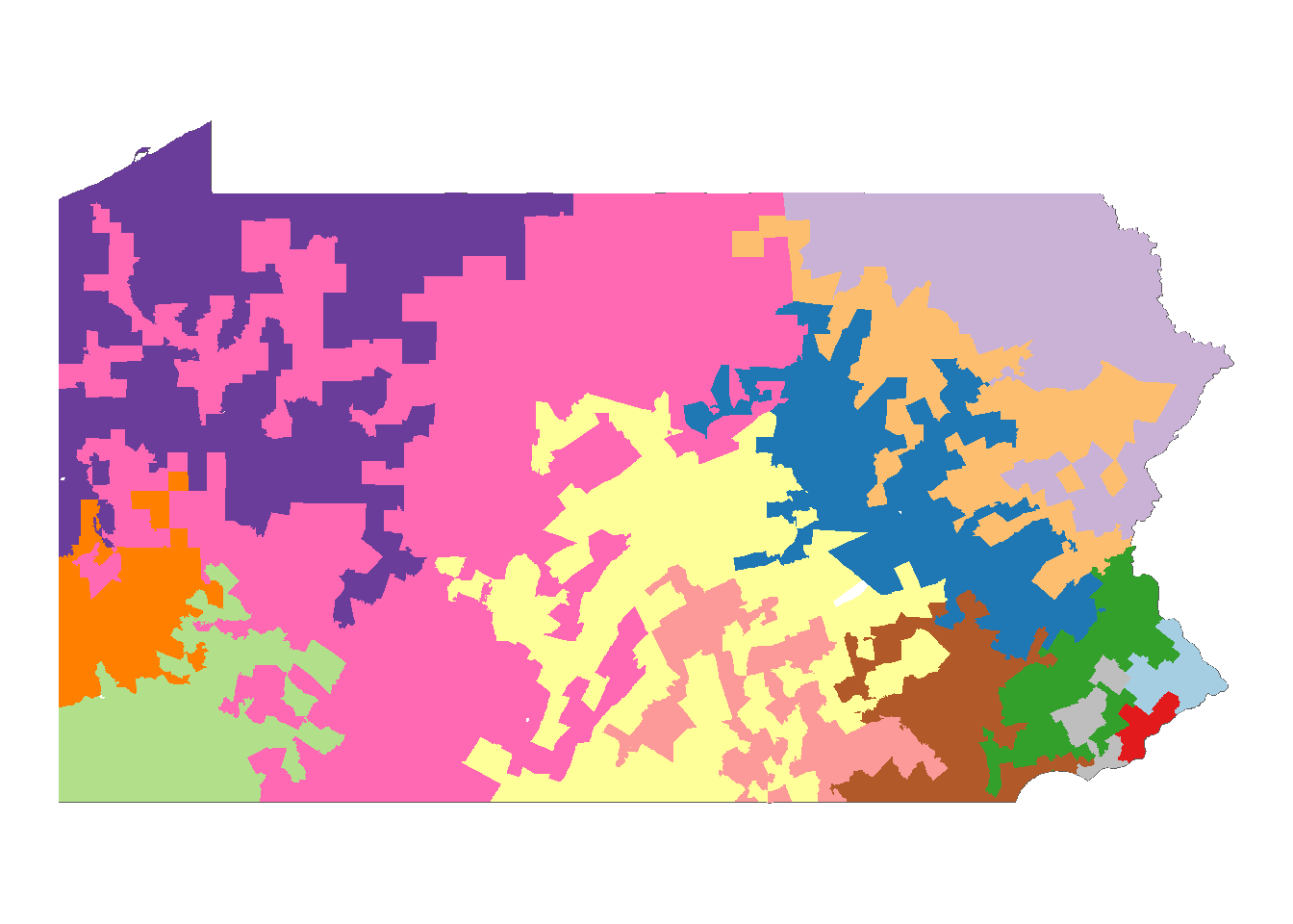
This is the same map but with county lines imposed. There does not appear to be much demographic distinction between bordering clusters; they tend to bleed into each other.
#### Adding County Lines ####

counties_geo <- tract_clusters |>
  separate(NAME, into = c("township", "county"), sep = ",") |>
  mutate(across(c(township, county), str_squish)) |>
  group_by(county) |>
  summarize()

map_greedy +
  geom_sf(data = counties_geo, fill = NA, lwd = 1, color = "black") +
  theme_void()
This code shows the clusters individually.
#### Show Clusters Separately ####

tract_clusters |>
  group_by(cluster) |>
  summarize() |>
  ggplot() +
  geom_sf(data = summarize(census_tracts)) +
  geom_sf(aes(fill = cluster), color = NA) +
  guides(fill = "none") +
  scale_fill_manual(values = cluster_palette) +
  facet_wrap(vars(cluster)) +
  theme_void() +
  theme(strip.text = element_text(size = 22))
Here’s an interactive map of the clusters. You may notice a few blank townships (like Centralia or S.N.P.J); that means it was one of the cases with an NA value for median age due to small population size. There are seven total missing townships/boroughs (see if you can find them!) I should also mention that all these visualizations are made with 2023 data. There is at least one township (East Keating) that has been absorbed by its neighbors since then – again due to population size.
#### Add Interactive Map ####

clusters_leaflet <- tract_clusters |>
  mutate(across(contains("pct"), ~.x * 100)) |>
  mutate(across(contains("pct"), round, 1))

fill_pal <- colorFactor(palette = cluster_palette, domain = clusters_leaflet$cluster)

labels <- sprintf(
  "<strong>%s</strong><br/>Cluster: %s<br/>Not Enrolled: %#.2f%%<br/>College: %#.2f%%<br/>65+ pop: %f<br/>White: %#.2f%%<br/>Unemployment: %#.2f%%<br/>Poverty: %#.2f%%<br/>Homeowner: %#.2f%%<br/>Total population: %#.2f%%<br/>Median Age: %f",
  clusters_leaflet$NAME, clusters_leaflet$cluster, clusters_leaflet$pct_not_enrolled, clusters_leaflet$pct_college, clusters_leaflet$pct_population_over65, clusters_leaflet$pct_dem_white, clusters_leaflet$pct_unemployment, clusters_leaflet$pct_poverty, clusters_leaflet$pct_homeowner, clusters_leaflet$total_population, clusters_leaflet$median_age
) %>% lapply(htmltools::HTML)

labels <- sprintf(
  "<strong>%s</strong><br/>Cluster: %s<br/>Not Enrolled: %s<br/>College: %s<br/>65+ pop: %s<br/>White: %s<br/>Unemployment: %s<br/>Poverty: %s<br/>Homeowner: %s<br/>Total population: %s<br/>Median Age: %s",
  tract_clusters$NAME,
  tract_clusters$cluster,
  percent(tract_clusters$pct_not_enrolled, accuracy = .01),
  percent(tract_clusters$pct_college, accuracy = .01),
  percent(tract_clusters$pct_population_over65, accuracy = .01),
  percent(tract_clusters$pct_dem_white, accuracy = .01),
  percent(tract_clusters$pct_unemployment, accuracy = .01),
  percent(tract_clusters$pct_poverty, accuracy = .01),
  percent(tract_clusters$pct_homeowner, accuracy = .01),
  comma(tract_clusters$total_population),
  comma(tract_clusters$median_age, accuracy = 0.1)
) |>
  lapply(htmltools::HTML)


clusters_leaflet <- st_transform(clusters_leaflet, crs = 4326)
leaflet_map <- clusters_leaflet |>
  leaflet() |>
  setView(lng = -77.1945, lat = 41.2033, zoom = 7) |>
  addProviderTiles(providers$CartoDB.Positron) |>
  addPolygons(fillColor = ~fill_pal(cluster),
              fillOpacity = .5,
              weight = .1,
              stroke = FALSE,
              label = labels,
              labelOptions = labelOptions(
                style = list("font-weight" = "normal", padding = "3px 8px"),
                textsize = "15px",
                direction = "auto")) |>
  addFullscreenControl()
leaflet_mapOn the whole, the clusters make visual sense. We could split the state of Pennsylvania in regions like Appalachia and Philly Suburbs and find their corresponding clusters. The queen weighting, which allows for clusters to maintain connection through corners, does create some jagged shapes but importantly avoids isolates. You’ll also notice that each cluster has one or two “token” townships/borough; this is especially important for rural regions that wouldn’t otherwise meet the 5% (~650,000) population requirement.
Cluster 1: The largest cluster, spanning a large portion of central PA along the Appalachian mountain range. This cluster is characterized by an older population structure comprise of mostly white homeowners.
Cluster 2: Contains municipalities along PA’s northeastern boarders, most notably Erie. This region contains similar characteristics to Cluster 1 but with higher poverty and lower median age (likely due to the increased number of urban areas).
Cluster 3: More of rural central and south-central PA. While still largely white, the inclusion of State College (home to Penn State University) pulls down the median age and 65+ population.
Cluster 4: Comprised of farmland and former coal mines on the eastern half of the state. This cluster matches closely with 1 and 2.
Cluster 5: Northeast corner of the state with the notable inclusion of Scranton. This cluster maintains an older, white population structure.
Cluster 6: Southwest corner of the state, closely bordering West Virginia. The cluster has higher poverty than its other rural counterparts but with a slightly younger population.
Cluster 7: Forms a band outside Cluster 5, including the cities of Wilkes-Barre and Allentown. The increase in urban areas results in a cluster with a lower proportionally white population of fewer homeowners. The representation of college grads remains low.
Cluster 8: The rural western outskirts of the Philadelphia metro area. While still comprised of mostly homeowners, the population is younger and relatively more diverse than bordering clusters 3 or 4.
Cluster 9: Western PA encompassing Pittsburgh. The heavily urbanized structure of Pittsburgh is conducive to lower overall home ownership and increased college graduation rates, but the region is older and less diverse than Clusters 11, 12, and 13 surrounding Philadelphia.
Cluster 10: Carves out most urban areas (Harrisburg, York, Chambersburg) from Cluster 3. While the population is younger than that of the clusters outside Philadelphia, it contains relatively fewer college graduates.
Cluster 11: Outer Philadelphia metro area. This cluster is defined by low poverty, high college graduation, and a slightly lower white population relative to other clusters.
Cluster 12: Suburbs west of Philadelphia. Similar to Cluster 11 but with higher poverty and unemployment.
Cluster 13: Suburbs north of Philadelphia with a long New Jersey border. The cluster is similar to Cluster 11 but with higher unemployment.
Cluster 14: The City of Philadelphia. Typical of a highly urbanized city, this mono-municipal cluster has the highest poverty, youngest population, and lowest white representation of all the PA clusters.
These descriptions were derived from the mean variable values of each cluster relative to all other clusters. Brief, relative descriptions for each variable by cluster can be seen in the Relative Characteristics section.
This method is exactly reproducible for any state with Minor Civil Divisions (MCDs), which is about half, though the process could be applied to counties within a state or region. In fact, Conor Tompkins’ post analyzed the entire eastern half of the continental United States, and he cited clustering the entire continental US as the next obvious extension. Any number of variables could be used in a future clustering project including geographic mobility, household types, religion, and/or occupation.
The simplification of geometries (necessary to produce clean MCD clusters) may have a severe impact on the output depending on the state, so simplify carefully. Also consider when rook or queen weights are more suitable (depends on potential isolates, complexity of shapes, etc.).
Below are the mean values over population for each variable. Overall, the variables of college, age, home ownership, unemployment, and poverty have the most variation over the 14 clusters.
#### Mean Characteristics of each cluster ####

tract_clusters |>
  select(total_population, median_age, contains("pct_"), cluster) |>
  st_drop_geometry() |>
  rename_with(~str_remove(.x, "^pct_dem_")) |> rename_with(~str_remove(.x, "^pct_")) |>
  pivot_longer(-c(cluster, total_population)) |>
  summarize(total_population = mean(total_population),
            value = mean(value),
            .by = c(cluster, name)) |>
  ggplot(aes(total_population, value, fill = cluster, label = cluster)) +
  geom_point(aes(color = cluster)) +
  ggrepel::geom_label_repel() +
  facet_wrap(vars(name), scales = "free_y", ncol = 2) +
  scale_x_log10(#expand = expansion(mult = c(.2, .2))#,
    #labels = label_number(scale_cut = cut_short_scale())
  ) +
  scale_y_continuous(#expand = expansion(mult = c(.2, .2)),
    labels = label_number(scale_cut = cut_short_scale())) +
  guides(fill = "none", color = "none") +
  labs(x = "Total population (log10)") +
  theme_bw()
Below are the distributions of each variable for each cluster.
#### Variable Distributions ####

cluster_dist <- tract_clusters |>
  select(total_population, median_age, contains("pct_"), cluster) |>
  st_drop_geometry() |>
  rename_with(~str_remove(.x, "^pct_dem_")) |> rename_with(~str_remove(.x, "^pct_")) |>
  pivot_longer(-c(cluster)) |>
  filter(cluster != 14) # remove Philadelphia from cluster_dist


plot_cluster_dist <- function(x, cluster_num){

  x |>
    filter(cluster == cluster_num) |>
    ggplot(aes(value)) +
    geom_histogram() +
    scale_x_continuous(labels = label_number(scale_cut = cut_short_scale())) +
    facet_wrap(vars(name), scales = "free", ncol = 4) +
    guides(fill = "none") +
    theme_bw()

}

#plot_list <- map(as.character(1:nclust), ~plot_cluster_dist(cluster_dist, .x))
plot_list <- map(1:13, ~plot_cluster_dist(cluster_dist, .x)) # only used because of Philadelphia carve-out

plot_list
[[1]]
[[2]]
[[3]]
[[4]]
[[5]]
[[6]]
[[7]]
[[8]]
[[9]]
[[10]]
[[11]]
[[12]]
[[13]]
These tables are rough, disputable summaries of cluster characteristics mostly derived from the mean characteristics visualizations.
| Var | Relative Position | Var | Relative Position |
|---|---|---|---|
| College | very low | Median Age | very high |
| Not Enrolled | mid-low | Population 65+ | very high |
| Poverty | mid-high | Homeowner | very high |
| Unemployment | mid-low | White | very high |
| Var | Relative Position | Var | Relative Position |
|---|---|---|---|
| College | very low | Median Age | mid-high |
| Not Enrolled | high | Population 65+ | mid-high |
| Poverty | high | Homeowner | high |
| Unemployment | mid | White | very high |
| Var | Relative Position | Var | Relative Position |
|---|---|---|---|
| College | low | Median Age | mid-low |
| Not Enrolled | very high | Population 65+ | mid |
| Poverty | mid | Homeowner | mid |
| Unemployment | very low | White | very high |
| Var | Relative Position | Var | Relative Position |
|---|---|---|---|
| College | mid-low | Median Age | high |
| Not Enrolled | mid-low | Population 65+ | mid-high |
| Poverty | mid | Homeowner | high |
| Unemployment | very low | White | very high |
| Var | Relative Position | Var | Relative Position |
|---|---|---|---|
| College | mid-low | Median Age | high |
| Not Enrolled | mid-low | Population 65+ | high |
| Poverty | mid-high | Homeowner | high |
| Unemployment | mid | White | very high |
| Var | Relative Position | Var | Relative Position |
|---|---|---|---|
| College | low | Median Age | high |
| Not Enrolled | low | Population 65+ | mid-high |
| Poverty | high | Homeowner | high |
| Unemployment | high | White | high |
| Var | Relative Position | Var | Relative Position |
|---|---|---|---|
| College | mid-low | Median Age | mid-high |
| Not Enrolled | mid-low | Population 65+ | mid-high |
| Poverty | high | Homeowner | mid |
| Unemployment | high | White | mid |
| Var | Relative Position | Var | Relative Position |
|---|---|---|---|
| College | mid | Median Age | low |
| Not Enrolled | high | Population 65+ | mid-low |
| Poverty | low | Homeowner | high |
| Unemployment | very low | White | mid |
| Var | Relative Position | Var | Relative Position |
|---|---|---|---|
| College | high | Median Age | mid-high |
| Not Enrolled | very low | Population 65+ | high |
| Poverty | mid-low | Homeowner | low |
| Unemployment | mid | White | high |
| Var | Relative Position | Var | Relative Position |
|---|---|---|---|
| College | mid-low | Median Age | low |
| Not Enrolled | mid | Population 65+ | low |
| Poverty | mid | Homeowner | low |
| Unemployment | low-mid | White | mid |
| Var | Relative Position | Var | Relative Position |
|---|---|---|---|
| College | very high | Median Age | mid |
| Not Enrolled | very low | Population 65+ | mid-low |
| Poverty | very low | Homeowner | mid |
| Unemployment | low | White | mid |
| Var | Relative Position | Var | Relative Position |
|---|---|---|---|
| College | high | Median Age | low |
| Not Enrolled | mid | Population 65+ | low |
| Poverty | mid-high | Homeowner | very low |
| Unemployment | high | White | very low |
| Var | Relative Position | Var | Relative Position |
|---|---|---|---|
| College | very high | Median Age | mid |
| Not Enrolled | low | Population 65+ | mid-low |
| Poverty | low | Homeowner | low |
| Unemployment | mid-high | White | mid |
| Var | Relative Position | Var | Relative Position |
|---|---|---|---|
| College | mid | Median Age | very low |
| Not Enrolled | mid-high | Population 65+ | very low |
| Poverty | very high | Homeowner | very low |
| Unemployment | very high | White | very low |